List Item With Actions
| Author | Renato Araujo Oliveira Filho | |
| License | GNU General Public License v3.0 | |
| Contact | renato.filho@canonical.com | |
| Framework | ubuntu-sdk-14.10 | |
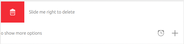
This widget provides an updated listitem which is what the core apps currently use. These listitems will be provided by the SDK with vivid onwards. However current RMT devices will ship with the ubuntu-sdk-14.10 framework which wouldn’t have these latest listitems.
Example:
Page {
    id: listitemwithactionspage

    ListModel {
        id: testModel
        ListElement { title: "Slide me right to delete" }
        ListElement { title: "Slide me left to show more options" }
    }

    ListView {
        id: nameListView
        anchors.fill: parent

        clip: true
        model: testModel

        delegate: ListItemWithActions {
            height: units.gu(9)
            width: parent.width
            color: "White"
            triggerActionOnMouseRelease: true

            leftSideAction: Action {
                iconName: "delete"
                text: i18n.tr("Delete")
                onTriggered: {
                    testModel.remove(nameListView.index)
                }
            }

            rightSideActions: [
                Action {
                    iconName: "alarm-clock"
                    text: i18n.tr("Alarm")
                },

                Action {
                    iconName: "add"
                    text: i18n.tr("Add")
                }
            ]

            contents: Label {
                text: title
                anchors.left: parent.left
                anchors.verticalCenter: parent.verticalCenter
            }
        }
    }
}
Properties
- color: color
- contents: Item
- internalAnchors: anchors
- leftSideAction: Action
- rightSideActions: Action <List>
- locked: boolean (false by default)
- triggerActionOnMouseRelease: boolean (false by default)
- showDivider: boolean (false by default)
- showUnderscore: boolean (false by default)
- enableHaptics: boolean (false by default)
Property Documentation
color
The background color of the list item.
contents
This property is used to define the contents of the list item. Unlike the SDK list items which only assigning values to the text property, the contents allows you to define whatever content you so wish. In the example above, a Label is used to show content in the list item. This could very well be replaced with a column with multiple labels with whatever formatting you choose. For example,
contents: Column {
    spacing: units.gu(2)
    anchors.fill: parent
    Label {
       id: title
       text: Test"
       font.bold: true
    }

    Label {
        id: subTitle
        text: "SubTitle"
    }
}
internalAnchors
Internal anchors allows you to define the anchors of the contents. The values are already defined by default, but if you so wish, you could change the anchors to better suit your application. For instance changing the top anchor of the contents can be done by,
internalAnchors.topMargin: units.gu(0)
leftSideAction
According to design, the left side of a list item can include only one action. An action can be defined easily by,
Action {
    iconName: "add"
    text: "Add"
    onTriggered {
        doSomething()
    }
}
rightSideActions
On right side of a list item, one can include a list of actions. Obviously it would be recommended to not add more than 3 actions since space is limited.
rightSideActions: [
    Action {
        iconName: "alarm-clock"
        text: i18n.tr("Alarm")
    },

    Action {
        iconName: "add"
        text: i18n.tr("Add")
    }
]
locked
This property can be used to lock the actions of a list item (essentially enabling/disabling them).
triggerActionOnMouseRelease
This property affects the right side actions behavior. If set to true, the user can swipe left to reveal the right side actions and execute an action by just hovering over it. By default, this is set to false meaning that the user needs to press on the action to trigger it.
showDivider
This property can be used to display a thin divider along the bottom of the list item.
showUnderscore
This property when enabled displays an underscore underneath the active action in the rightSideActions.
enableHaptics
This property enables haptic feedback when triggering actions in the list item.