Radial Bottom Edge
| Author | Nekhelesh Ramananthan | |
| License | BSD License | |
| Contact | nik90@ubuntu.com | |
| Framework | ubuntu-sdk-14.10 | |
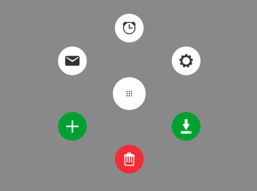
This component provides a unique way to show actions buttons using the bottom edge. It allows app developers to decide how many actions they want to show and customize it to their liking.
Example:
RadialBottomEdge {
    actions: [
        RadialAction {
            iconName: "alarm-clock"
            iconColor: UbuntuColors.coolGrey
            onTriggered: console.log("Alarm..zZz")
        },

        RadialAction {
            iconName: "settings"
            iconColor: UbuntuColors.coolGrey
        },

        RadialAction {
            iconName: "save"
            iconColor: "white"
            enabled: false
            backgroundColor: UbuntuColors.green
            onTriggered: console.log("save")
        },

        RadialAction {
            iconName: "delete"
            iconColor: "white"
            enabled: false
            backgroundColor: UbuntuColors.red
            onTriggered: console.log("delete")
        },

        RadialAction {
            iconName: "add"
            iconColor: "white"
            backgroundColor: UbuntuColors.green
        },

        RadialAction {
            iconName: "stock_email"
            iconColor: UbuntuColors.coolGrey
        }
    ]
}
Properties
- hintSize: int
- hintColor: color
- hintIconName: string
- hintIconSource: url
- hintIconColor: color
- bottomEdgeEnabled: boolean
- actions: RadialAction <list>
- actionButtonSize: int
- actionButtonDistance: int
- expandAngle: int (defaults to 360 deg)
Note
All properties except for hintIconSource have well defined defaults. As a developer, you could choose to go with the defaults or change them to your liking.
Property Documentation
hintSize
The size of the hint shown in the bottom edge. It defaults to 8 grid units.
hintColor
The background color of the hint shown in the bottom edge. By default it uses the ubuntu palette’s overlay color.
hintIconName
The name of the icon to display. Valid icon names can be found in the suru-icon-theme.
Note
If both hintIconName and hintIconSource are specified, then hintIconName will be ignored.
hintIconSource
The source url of the icon to display. It has precedence over hintIconName.
hintIconColor
The color of the icon displayed in the hint.
bottomEdgeEnabled
Property to enable/disable the bottom edge. When disabled, the bottom edge hint will be hidden.
actions
This property is used to define a list of actions to be shown in the radial menu. The list takes a RadialAction which inherits Action. A RadialAction adds 3 properties on top of what Action provides which are iconName, iconColor, enabled and backgroundColor.
RadialAction {
    iconName: "add"
    iconColor: "white"
    enabled: false
    backgroundColor: "green"
}
This helps defining properties for each action separately and allow for customization.
actionButtonSize
The size of all the actions buttons. By default it is set to 7 grid units. Increasing this size would also require increasing the actionButtonDistance value as well.
actionButtonDistance
The distance (separation) between the action buttons and the center of the radial menu.
expandAngle
The expand angle defines the spread angle. By default, it is set to 360 degrees which places the buttons in a full circle pattern. If it was set to 180 degrees, then the buttons would follow a semi-circle pattern.