Welcome Wizard
| Author | Nekhelesh Ramananthan, Michael Spencer | |
| License | BSD License | |
| Contact | nik90@ubuntu.com | |
| Framework | ubuntu-sdk-14.10 | |
This component shows users a welcome wizard which can be used to introduce and showcase the features of the app to guide the user. The API of this component is rather simple and provides a lot of freedom to the developer to present his content.
It is recommended to put the Walkthrough{} component inside a qml Component{} since it is not run frequently. Walkthrough derives from a Page. So push it into a pagestack to show the welcome wizard as shown below in the example.
Example:
MainView.qml
MainView
{
    Component {
        id: pageComponent
        Walkthrough {
            id: walkthrough

            appName: "Component Store Gallery"

            onFinished: {
                console.log("Welcome Wizard Complete!")
                // Here perhaps save isFirstRun variable to the disk
                stack.pop()
            }

            model: [
                Slide1{},
                Slide2{}
            ]
        }
    }

    component.onCompleted: pagestack.push(pageComponent)
}
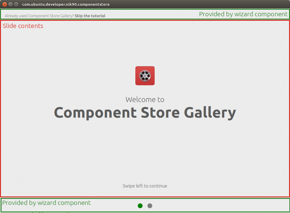
Slide1.qml
import QtQuick 2.3
import Ubuntu.Components 1.1

// Slide 1
Component {
    id: slide1
    Item {
        id: slide1Container

        UbuntuShape {
            anchors {
                bottom: textColumn.top
                bottomMargin: units.gu(4)
                horizontalCenter: parent.horizontalCenter
            }

            image: Image {
                smooth: true
                antialiasing: true
                fillMode: Image.PreserveAspectFit
                source: Qt.resolvedUrl("assets/flashback.png")
            }
        }

        Column {
            id: textColumn

            anchors.centerIn: parent

            Label {
                text: "Welcome to"
                fontSize: "x-large"
                height: contentHeight
                anchors.horizontalCenter: parent.horizontalCenter
            }
            Label {
                text: "Component Store Gallery"
                font.bold: true
                height: contentHeight
                font.pixelSize: units.dp(50)
                anchors.horizontalCenter: parent.horizontalCenter
            }
        }

        Label {
            id: swipeText
            text: "Swipe left to continue"
            horizontalAlignment: Text.AlignHCenter
            anchors.bottom: parent.bottom
            anchors.bottomMargin: units.gu(2)
            anchors.horizontalCenter: parent.horizontalCenter
        }
    }
}
Properties
- appName: string
- isFirstRun: boolean
- model: Item<list>
- completeColor: color
- inCompleteColor: color
- skipTextColor: color
Signals
Property Documentation
appName
Name of the application that is shown in some parts of the welcome wizard.
isFirstRun
Boolean property to determine if the welcome wizard was run for the first time or not. It is recommended to store this variable to the disk using U1dB or Qt.labs.settings to remember the welcome wizard run state.
model
This property stores the welcome wizards slides that are shown to the user. Create your content and store them in separate files per slide. So if you have 3 slides in your welcome wizard, you could define them as Slide1.qml, Slide2.qml and Slide3.qml and then reference them as,
model: [
    Slide1{},
    Slide2{},
    Slide3{}
]
The slides should only contain the content you want to show. Everything else like the dots, divider, title etc are handled by the welcome wizard component itself. Think of these slides as delegates in a listview which only house the content itself.
completeColor
This property sets the color of the bottom circle to indicate the progress of the user. By default it is green.
inCompleteColor
This property sets the color of the bottom circle to indicate the slides left in the wizard. By default it is grey.
skipTextColor
This property sets the color of the skip text shown at the top of the welcome wizard.
Signal Documentation
finished()
This signal is fired automatically when the user press the skip button. It can also be made to fire manually to exit the welcome wizard. You can perform exit tasks when this signal is fired like updating the isFirstRun variable and storing to disk etc.
Button {
    id: continueButton
    color: "Green"
    height: units.gu(5)
    width: units.gu(25)
    text: "Exit Welcome Wizard"
    anchors.horizontalCenter: parent.horizontalCenter
    onClicked: finished()
}